Building Engagement through IMC.

Our final project for Digital Imagery was to create an Integrated Marketing Campaign for our employer or a non profit. I chose to create the IMC campaign for the annual charity golf outing put on by my employer, Eastwood Homes, to raise money for the Levine Children’s Hospital.

Company Analysis:

Eastwood Homes, founded in 1977, is a regional homebuilder based in Charlotte, N.C., with six divisions in the Carolinas and Virginia. The “Built With Care” builder is the 45th largest homebuilder in the U.S., yet prides itself on being a private, family owned company run by father-son team Joe and Clark Stewart. The new home builder offers single-, two- and three-story homes for first-time homebuyers, move-up buyers and downsizers. Features include up to three car garages, second story porches, sunrooms, covered patios, finished basements, and all the designer features sought after by today’s buyers.

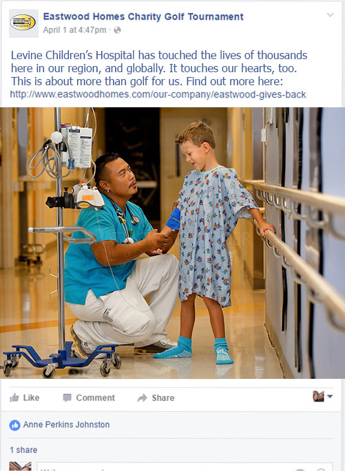
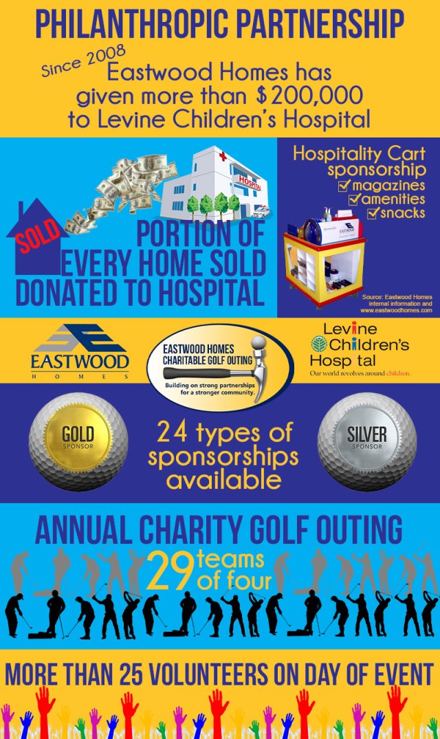
Eastwood Homes believes in building up its community while building its new homes. In it’s flagship city of Charlotte, the construction company also drives its largest philanthropic effort – the support of the Levine Children’s Hospital, which was founded in 2007. A portion of every home sale goes to the regionally vital hospital. Eastwood also provides a hospitality cart at the hospital, which supplies families much needed necessities like toothpaste and deodorant, as well as other materials like magazines, books, and snacks. Often times, a trip to Levine Children’s Hospital is unexpected for families, and Levine and Eastwood both strive to lessen this dreaded experience.

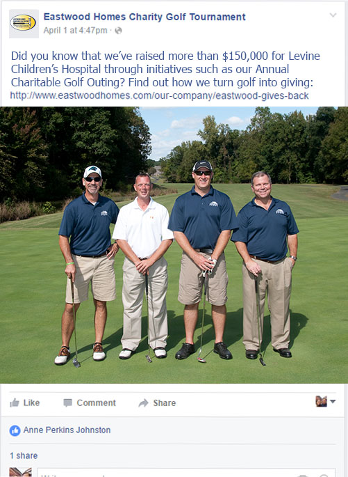
Eastwood Homes holds annual charitable golf outings to raise money for Levine Children’s Hospital. The builder’s trade partners support sponsorships that drive the fundraising effort of the event. In the three years that Eastwood has held the Charitable Golf Outing, $156,000 has been raised for the children’s hospital from the event alone.

While the builder has successfully moved into the digital world for its modern day marketing strategy for its new home sales, the Charitable Golf Outing has yet to claim the attention that such a large fundraising effort for a well-known hospital should receive. This IMC campaign will increase the community awareness of the Eastwood Homes philanthropic effort while also raising additional funds for the hospital through a new effort to raise donations from the general public.

Logo Redesign:

New Logo, left;  Original Logo, right

logo-WO.jpgGolf-Tournament-Logo1

My logo redesign seeks to modernize the existing logo, which I think is currently very appropriate. However, the existing logo does not reflect the construction background of this fundraiser at all. Most sponsors and participants of the golf outing are in the construction industry and many of those individuals are male. The new logo design incorporates strong fonts with a simple design that will resonate with a predominately male construction-oriented audience. I think the tagline is the most important part of the logo redesign. It reinforces how important Eastwood Home’s trade partner sponsors are to the success of the annual event. Without their support, the fundraiser – quite simply – would not exist. It also supports the idea that the company’s founders believe it is important to do their part to strengthen the communities where they build.

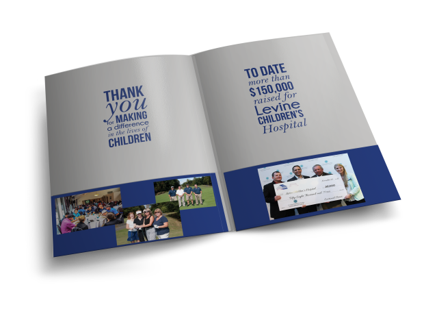
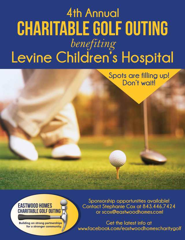
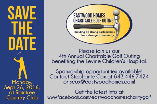
Promotional Print Items:

Pocket folders can be distributed to sponsors and to golf teams. They can also be used while soliciting new sponsors for the event. Presentation_Folder_Mockup_02.png

Presentation_Folder_Mockup_01.png

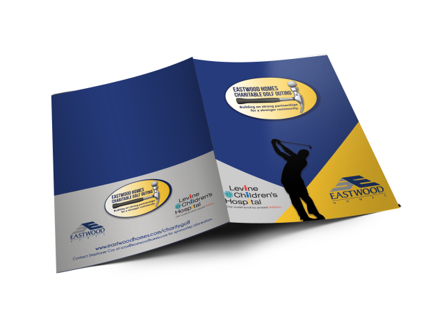
Promotional Flyers can be distributed in e-blasts and posted in our model homes, while Informational Postcards can be sent out by mail to our previous sponsors and participants.

flyer-WO

postcardWO.jpg

Social Media:

Eastwood Homes currently uses Facebook to promote its annual Charitable Golf Outing, but not to the extent that it could. This year, the company plans to announce each of its sponsors on its Facebook page and tag those companies when possible, to increase awareness about the event. The company also plans to add a new aspect to this fundraising effort by starting a Gofundme page to allow other individuals including employees and homeowners a chance to participate in the philanthropic event. That effort will be promoted primarily through the Facebook page. Regular posting of two times a week would increase engagement on this page. Posting should increase as the event gets closer.

Eastwood Homes should also consider incorporating its presence on Twitter to expand its reach for this fundraiser. Many professional entities that are tied to this charitable event are on Twitter and cross-promotion is very likely. While it is not recommended to start a separate Twitter account, incorporating tweets about the golf outing once or twice a week would make a strong impact on expanding the reach of the event.

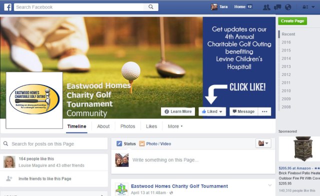
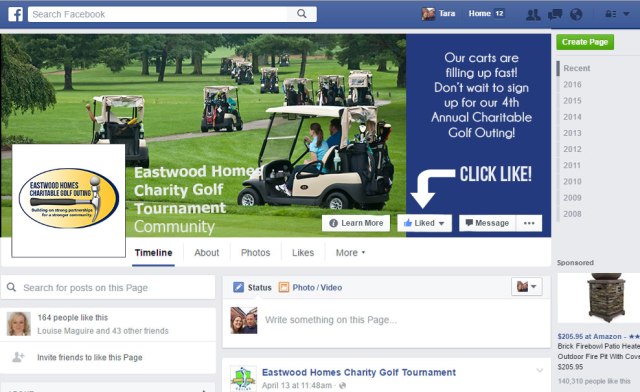
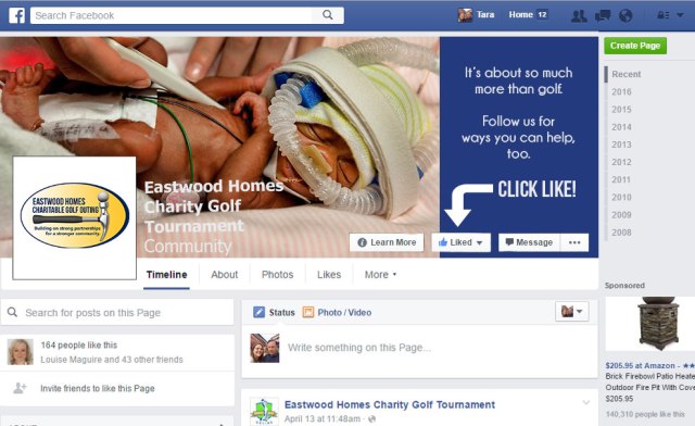
Below are three Cover Photo examples that can be used on Facebook:

COVER_full1COVER_full2COVER_full3

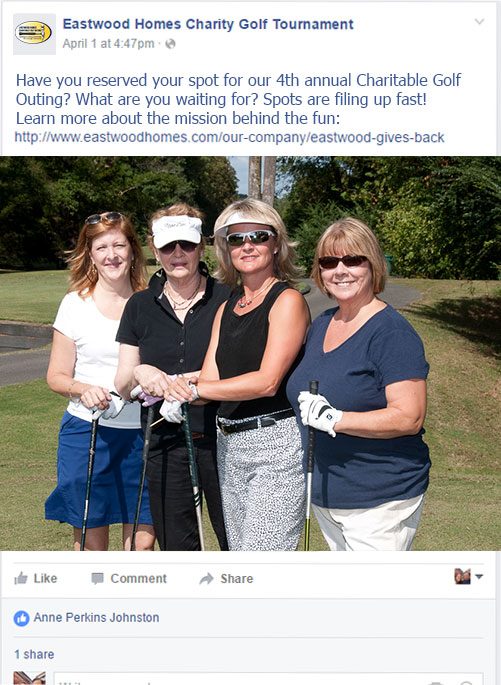
Below are three examples of Timeline Photos that can be used on Facebook:

timeline1timeline2timeline3

Infographic:

infographic


Orange you glad I’m an Infographic.

oranges1

This week’s assignment (if you can’t tell) is to complete an infographic! And it’s a punny one at that!

We were tasked with including at least 10 facts from one of three provided articles. I chose to do my infographic using the facts found in an orange nutrition facts article. Here is the source of my information:

http://www.livescience.com/45057-oranges-nutrition-facts.html

I found this particular assignment difficult primarily because we had to use 10 facts. I really liked my design after 6 facts, but ended up making the graphic longer so that I could incorporate more designs. It was also a very time-consuming project and the portions that I did early on are much more creative than the ones I did later! So, a word of advice is to give yourself plenty of time to include breaks! It was very challenging to think graphically, but the assignment really opened my eyes to that process, and I think as I move forward I will begin to think in that manner more, as in, ‘how would I show that graphically?’ I love infographics, and I would love to become very skilled at creating them. Another tip: I should have created character styles so that I could change a font via the character style at any point and my previous styles would also be updated. I struggled with that as I finished the project and looked at it and wanted to tweak things like fonts.

My strategy was simply to start with the stats that I felt were easier to illustrate. I am not sure that was much of a strategy but it got me started and that was important since this was my first infographic creation! I also wanted to use a fun font for this infographic, since it is about a happy subject like delicious oranges, but then as I continued on in the process, I discovered that the bolder, simpler fonts were easier to read.

Overall, this infographic was a great learning experience! I am looking forward to doing another one now that I’ve made a few “mistakes” in the process and know better what to expect.

Spring Break goes social.

wo-InstagramOverlay
Instagram Overlay

We were asked to create a social media campaign for a travel company for this week’s Digital Imagery assignment. Specifically, the campaign will center of Spring Break. We were asked to create three Facebook cover photos, one Twitter cover photo and one Instagram overlay for the Spring Break travel holiday.

For my project, I chose the Sky Adventures Costa Rica adventure parks. My campaign features the phrase “Make this Spring Break unforgettable” because I believe Spring Break is often associated with parties in beach locations, and sometimes partying can lead to memory lapses! However, I think there are many students who are looking for more than hangovers for their Spring Break. Students looking for lifelong memories and adrenaline-filled adventures would be more interested in activities like zip lining over the rain forests of Costa Rica.

For my cover photos, I simply used photos of zip lining and other Sky Adventures activities like horseback riding through the rain forest. I believe the images will easily share the message that you can do more than party on Spring Break, instead you can have an adventure that you will never forget. I also included the logo in each of the cover photos. My font is Champagne & Limousines Bold with a slight drop shadow and bevel to make the font stick out. I even added a Lens Flare behind the text to help make the text easier to read.

For my Instagram overlay, I chose Harlow Solid Italic font because it was both fun, but not too light and airy for an adventure-minded Spring Breaker. I also included three shapes (created using the Custom Shape Tool in Photoshop) below the text that are a sun, waves and barefoot footprints, because these images seem to relate to the idea of Spring Break in Costa Rica.

Twitter Cover Photo
Twitter Cover Photo
wo-facebook-cover-1
Facebook Cover Photo

Disclaimer: This social media campaign is for educational purposes only. I am not affiliated with Sky Adventures Costa Rica. 

Building an Email Campaign.

email-campaignWO

This is part two of our web ads project for our Digital Imagery class where we build an email campaign to coordinate with our banner ads.

Our banner ads were designed for a holiday. I chose the Fourth of July and the theme “Declare Your Independence From Rent!” for my ad campaign for Eastwood Homes, a regional home builder in the Carolinas and Virginia. First time home buyers are important to the business of Eastwood Homes and often times the focus of ad campaigns.

I mimicked the look of the company website by duplicating the navigation bar and logo which appears at the top of their site. I did have to enlarge the font from the scale of the navigation bar on the company website because the smaller scale was hard to read within the size dimensions of the email campaign. I also incorporated the “share” button into the navigational bar because I wanted it to appear at the top of the page but I did not want it to get lost in the actual email campaign. The company’s current email campaigns feature the triangle indicator on the “Find Your Home” link in the navigation bar because that is where they want to direct traffic to the site. That also is the intention of this ad campaign, so I also left the triangle indicator over that link.

My call to action “Buy Now” features a slight drop shadow to make it appear as if it is floating off the page. The main image in the email campaign is the home that was featured in the banner ads last week. The interior photography is from the same floorplan. My promotional text uses a common promotion among home builders: the appliance package. This can be effective with first time home buyers who do not have their own appliances, such as a washer and dryer and refrigerator.

The contact information is for the company’s Internet New Home Specialist who’s job is to schedule appointments for the on-site New Home Specialists. The bottom bar actually reinforces the hope that the email recipient will contact the internet specialist by including two links to do so – one for email and one for a phone call (perfect for a mobile platform.) It also features the unsubscribe link because that link should be in an easy-to-locate position. It’s better to have a smaller email list of people interested in your product than a larger one full of people who won’t even open your emails. Quality over quantity!

Disclaimer: While I do work for Eastwood Homes, this campaign is for educational purposes only and was not created as a campaign for the company. 

Building a Web Ad Campaign.

Leaderboard

Skyscraper
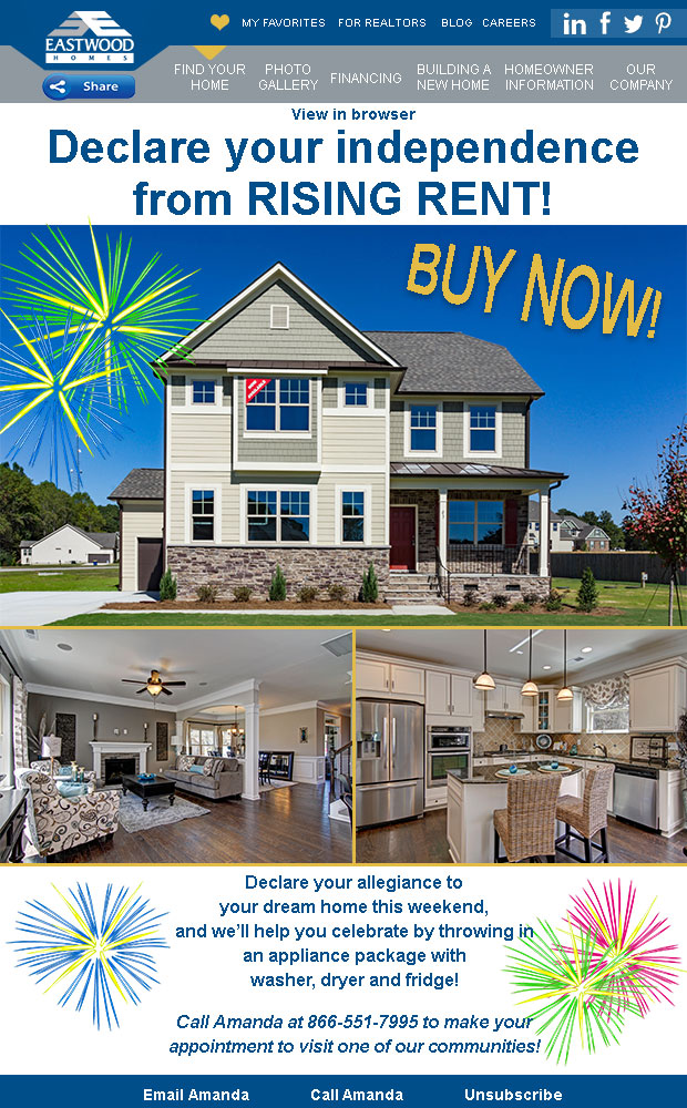
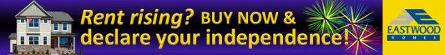
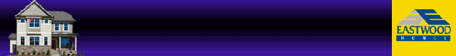
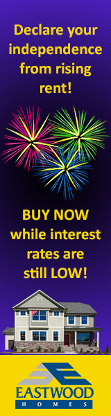
For this week’s digital imagery assignment, we were asked to create a web ad campaign that included the following banners:

  • Leaderboard: 728 x 90
  • Rectangle: 300 x 250
  • Skyscraper: 160 x 600
  • Button: 320 x 75

I chose to do an ad campaign with my employer in mind. I work for a Charlotte-based homebuilder, Eastwood Homes, and we often have banner campaigns online. This particular campaign is geared toward the Fourth of July holiday, and is aimed at first time homebuyers who are experiencing rising rent prices. The ad uses the company’s branding including the logo and the colors of blue and yellow. The ad campaign also features one of the company’s most popular floorplans, the Drexel.

I envision that my leaderboard banner would be positioned at the top of a webpage, as it appears here. My Skyscraper would run alongside a webpage, also as it appears here. The rectangle banner would have more flexible and could appear in many places, alongside text or even at the bottom. The button, the smallest of the banners, could be used in many locations and would support the overall campaign. My animated .gif file incorporates the design of the leaderboard and would also appear at the top of a webpage.Rectangle

Disclaimer: While I do work for Eastwood Homes, this campaign is for educational purposes only and was not created as a campaign for the company. 

Button

 
Leaderboard

Website Redesign.

For this week’s homework, we were asked to redesign one of our favorite restaurant’s webpages. I chose a restaurant very close to my home that my family loves to frequent when they visit me from Pennsylvania. Captain Steve’s is a locally owned “fish camp” style casual restaurant in Fort Mill, SC, just outside of Charlotte. It also has a location in Charlotte, which happens to be the website I used (because I could not find one for the Fort Mill location.)

(Disclaimer: this website redesign is for educational purposes only and I am not affiliated with the restaurant.)

Original:

Capture

Redesign:

First, the wireframe:

Wireframe-wo.jpg

Next, the mockup (based on the wireframe):

website-wo

Captain Steve’s existing web design has everything you need in for an effective website. The hours are prominently displayed, the menus are easy to find, customer reviews are readily available. But the design of the information could be improved with different images, more modern icons and buttons and with more web friendly fonts.

One thing I felt needed attention immediately was the navigation bar. I didn’t like that two of the links required two lines while the rest didn’t. I recreated this first on the wireframe and then in the mockup with a more uniform look using fonts and boxes of the same size. I also coordinated the footer bar with the navigation bar for a uniform look, which is also an improvement on the website that although not visible in the screenshot above has a gray area at the bottom with a few links. I included all the links on the page as just another way to navigate to this information, and as a backup in case one of the buttons failed to load properly.

Of course, the food is the most important part of a restaurant and crab legs are one of the most popular offerings of a seafood restaurant. I decided to feature the crab legs as the main image on the webpage for those reasons but also because it is an all-you-can-eat special each week. It also coordinated nicely with the colors in the logo, which I displayed in the center of the navigation bar. As you can see, the background image is that of a boat on water. I also felt this fit the theme of the restaurant, and the color of the water and sky coordinated with the blues in the logo.

I chose yellow as the color of the menu bars and icons because it worked well with the main image and also pops off the page. It is also associated with happiness.

For the three main buttons on the page, I chose to make these the links for hours and locations, reservations and reviews. I felt that these three areas are the most important buttons on the page because they serve the purpose of getting someone in the restaurant. I included the menus in the top left navigation bar icon because I also felt a website visitor would naturally look to that location as well.

Social icons are included because many people choose to follow their favorite businesses online and an online presence is important for building clientele and for building reviews, too. For that reason, I was sure to include Yelp in the icons as it is very popular for customer reviews.

Mood: Plum and Raspberry. 

moodboardwo.jpg
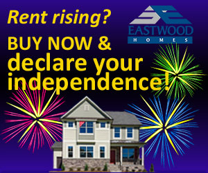
We have been tasked with creating a Mood Board for our personal brand or another brand. Since the colors for my (in progress) web page are black, white and red, I decided to complete a mood board for another company. However this company is close to my heart. I am an independent consultant for Jamberry and I love not only the fact that I get paid to have pretty nails, as the consultants often say, but also what the company stands for, such as empowering women to go after their goals.

The colors of Jamberry are predominantly Plum and Raspberry (two of my favorite colors – purple and pink), with black (and also gray) as accents. I have included the HEX codes for those official colors on this mood board.

Choosing photos and images for this mood board was quite easy as I have plenty of images at my disposal, including those I have taken myself.

The images in the top-middle and right-middle and right-bottom are all my images. The other images are photos taken by other consultants with the exception of the top right image, which is a photo taken by Jamberry. (Do you recognize the Vanderpump Rules SUR-vers?) I tried to stay within the colors of my mood board when featuring the manicures.

And finally, the common phrase of “I get paid to have pretty nails” is so common that there are social media images of the saying for use on the web. I included that image in the center of the mood board because, while Jamberry is an avenue for many women to make extra cash, it really comes down to beautiful manicures and pedicures!

Tresses, a logo design.

LogoTresses

Our assignment for Digital Imagery in Web Design this week was to create a logo. In my case, I chose the imaginary high-end hair salon in Los Angeles that focusing on modern hairstyles and hair coloring. It’s clientele is celebrities and young professionals who are interested in fashion-forward designs.

I envisioned  a sleek, high style salon with a minimalist designs scheme inside the salon. I chose a font, Caviar Dreams, because it complimented that modern feel. I used that font for all the letters of the salon name, “Tresses,” with the exception of the middle “SS’s” for which I used Blakely Light. I adjusted the tracking and kerning for the letters of the business name so that they slightly touched. For the “SS’s” which I tried to make look like long hair tresses, I adjusted the vertical scale so they would appear like long hair. I duplicated the “SS’s” again to make it appear like long hair.

I also added a slight bevel and drop shadow to the logo to make the logo pop slightly off of the page.

The Great Redesign.

Original                                                Redesign

For this week’s Digital Imagery in Web Design, we were tasked with redesigning a book cover. I landed on The Great Gatsby. In case you haven’t read the book or watched the movie, here is a description of the tale found on Amazon:

The Great Gatsby, F. Scott Fitzgerald’s third book, stands as the supreme achievement of his career. This exemplary novel of the Jazz Age has been acclaimed by generations of readers.

The Great Gatsby, F. Scott Fitzgerald’s third book, stands as the supreme achievement of his career. This exemplary novel of the Jazz Age has been acclaimed by generations of readers. The story of the fabulously wealthy Jay Gatsby and his love for the beautiful Daisy Buchanan, of lavish parties on Long Island at a time when The New York Times noted “gin was the national drink and sex the national obsession,” it is an exquisitely crafted tale of America in the 1920s.

The Great Gatsby is one of the great classics of twentieth-century literature.

This book is most notably a continuous party. It is living life to its fullest, in print form. It is the Jazz Age, and it represents the decadence of the age.

The original book cover is a set of eyes, which ties to the fact that Gatsby is an enigmatic character. At the beginning of the story, no one has met him, or spoken with him. But that changes over time.

My redesigned book cover hopes to portray that decadence that the book captures, specifically the parties that Gatsby orchestrates at his home. The man holding the wine glass is Mr. Gatsby, and the party goers are within the wine glass to show his power to quite easily throw a memorable party. Of course, the gold confetti also supports the extravagance of the era. The tagline, “You only live once,” is part of a quote from the novel.

To create the redesigned book cover, I started with the wine glass image. First I used the magnetic lasso tool to cut out the arm and wine glass from the background. Next, I cut the wine portion of the wine glass out  – again using the magnetic lasso tool – and pasted it back in a new layer. I then used a clipping mask to replace the party-goer image with the wine in the wine glass. The original image also featured a woman’s arm with a red sweater, so I cut out the sweater and pasted in a suit sleeve to make it appear that the arm belonged to Mr. Gatsby. I finished this part of the image by adding a gold “outer glow” and drop shadow to the arm and wine glass to make the image stand out, but also to support the idea that everything was gold and decadent in that era and at Mr. Gatsby’s home.

For the title and author lines of the front cover and spine, I used Riesling Regular font because it fit in with the era the book was set in. For the tagline and the summary on the back cover, I used Caviar Dreams Regular, again because it supported the era of the book’s setting, and because it paired well with the Riesling font. With the exception of the summary on the back cover, I used similar text effects for all the text and that was inner glow, outer glow, and bevel and emboss. For the spine which was set on a lot of confetti and the tagline, I also used satin and cover overlay to help the font stand out.

For the background, I found the gold confetti image but edited it by using the spot healing brush to remove some of the gold confetti pieces from the area around the title, author and tagline of the book. I felt that it was too distracting to be effective.

I also used a slight drop shadow on the background block for the back cover summary to make it float slightly above the background image. I also added a drop shadow to make the spine appear that it was above the front and back cover, as it would appear in real life.

I am very pleased with the execution and, more important, the feel of this book cover. I think it represents the lavish atmosphere of the era.

I am not associated with the book, publisher or author and this book cover redesign is solely for educational purposes.

Easter in Tiffany Blue.

TiffanyEasterBasketWOpt

There’s something about Tiffany Blue that speaks to me. For this week’s assignment for Digital Imagery in Web Design, we are asked to focus on a company who employs an effective Integrated Marketing Campaign. There are plenty of brands who do IMC well. But, as I was trying to figure out which company to focus on, I remembered a recent trip to the eye doctor. I was shopping for eye glasses, and as I walked around the displays, my eyes fell upon a display with a familiar blue color. Instantly, without even trying on the glasses, and from across the room, I wanted those glasses. I hadn’t even really looked at them yet, but I wanted Tiffany & Co. eye glasses! I kid you not, my heart swooned. That is effective IMC. It is branding across multiple channels that is familiar and consistent. It makes a company easily identifiable. It stirs up emotion. Just like the display of Tiffany & Co. eye glasses did.

We were asked to create an image that would easily be incorporated into a company’s existing IMC. Valentine’s Day is passing, but that seemed obvious, so I focused on the upcoming Easter holiday instead.

To begin, I found the HEX color for the official Tiffany blue, #60DFE5, listed online. That color transcends words as the image of the brand and is so easily recognizable as Tiffany & Co., so I used it as my background like the brand sometimes does with its own marketing. In fact, Tiffany Blue and the Tiffany font (which is similar to Bakersfield Old Face D) are two of the most identifiable characteristics of the company’s branding. It’s common on the social media pages through the profile images, but a review of their posts on Instagram, for instance, show that they do not have a set template for their posts. They vary in design, but the Tiffany Blue or the logo are usually a part of their posts at some point. Because of the variation, I believe that the color and typography are a key part of their IMC.

Next, I removed the background of the Easter basket and saved it as a .png to support the transparency. I placed that file over the background. On top of that, I placed an image of the Tiffany & Co. gift box. I angled the box and resized it appropriately. To make this image sit inside the Easter basket, I created a layer mask. With a paint brush and the color set on black, I removed the background around the gift box so that you could see the other Easter eggs, and then reversed the color to white and allowed the eggs in the front to show in front of the gift box, so that it appeared the box was sitting within the eggs.

I added the logo to the bottom of the image beneath the basket, and also added right justified font to the right side of the image. I used the Bakersfield Old Face Regular for the additional text.

Finally, I added some minor effects to the image. I added a satin finish with blend mode of darken to the basket, while adding a satin finish with blend mode of soft light. I did this so that the basket would be less prominent while the Tiffany & Co. box would seem to glow among the rest of the Easter basket.

To help show why I feel that the Tiffany Blue and the font of the logo are the most identifiable characteristics of the brand and IMC, here are a few examples from the brand’s presence online and their advertising:

If you would like to step into the world of Tiffany Blue, you can do so at any of the following social media pages:

Facebook, Instagram, Twitter, Pinterest

Or online on their website, here.

Disclaimer: I am not affiliated with the brand Tiffany & Co. in any way. This project is for educational purposes only.